Really professional, efficient, creative. Listened to what we wanted and delivered the branding exactly as we envisaged it.
JULIE ROBINSON, FOUNDER, TIME TO CONNECT
ABOUT THE BRAND
Time to Connect is a parenting support initiative led by Julie — an experienced early years educator and respected voice in child development. She also happens to run the nursery my daughters attend, so I’d already seen first-hand just how capable and trusted she is.
Alongside a business partner at the time, Julie developed a suite of parent-facing resources — workshops, one-to-one sessions, printed guides and a podcast — all designed to make parenting feel more connected and less overwhelming.
THE CHALLENGE
Julie approached me with a clear need: they had valuable resources and events, but no unified brand identity to tie them together. The offering spanned podcasts, workshops, printed guides and more, and needed an identity that could hold it all with confidence and care.
The goal was to create something calm, nurturing and trustworthy — but still professional, credible and forward-looking. It also needed to sit comfortably alongside her existing brands, including Eagley School House Nurseries and Mini Minds Matter, without clashing or competing.
THE APPROACH
We met in person to explore the vision, reviewing mood boards and early ideas in a collaborative, open session. I helped refine the creative direction, bringing structure and clarity to what Time to Connect should represent: a distinct, parent-facing brand with the flexibility to grow across workshops, YouTube, blogs and podcast platforms.
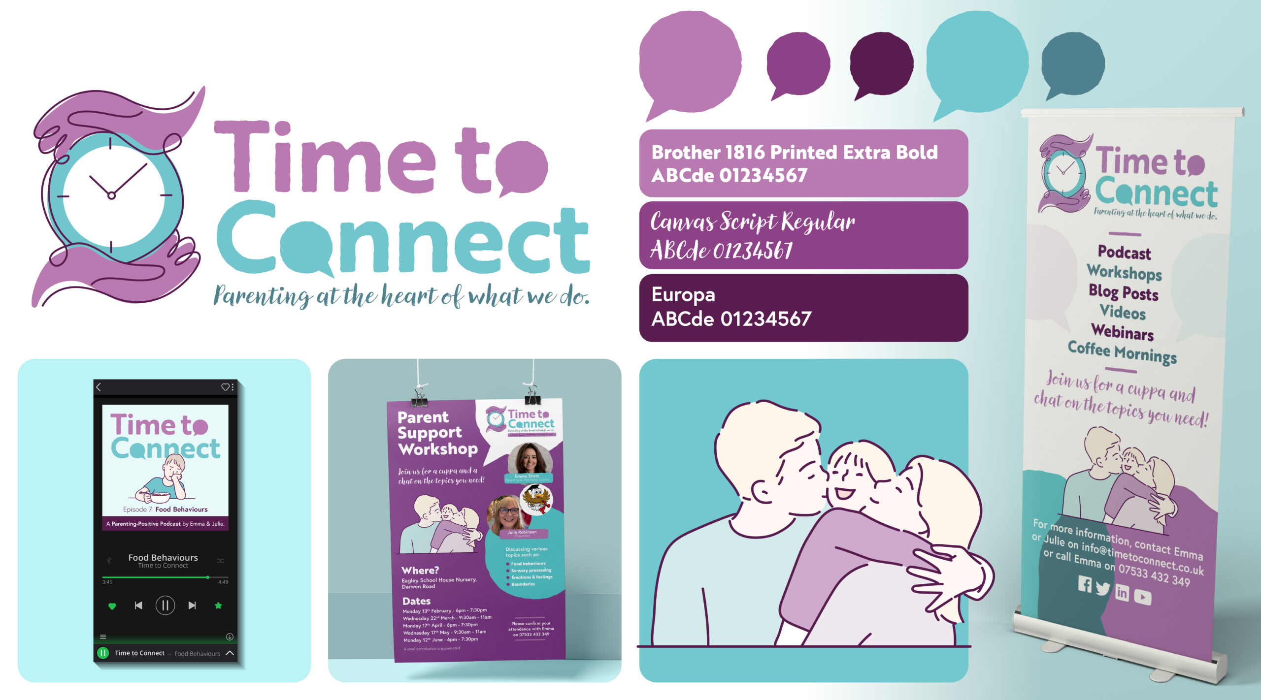
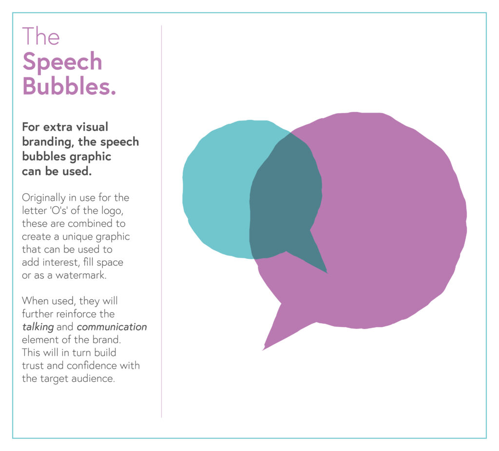
Once the foundations were in place, I developed logo concepts centred on interlocking speech bubbles — a simple but distinctive brand device representing conversation, connection and shared experience. This device became a flexible visual element across both digital and print applications.
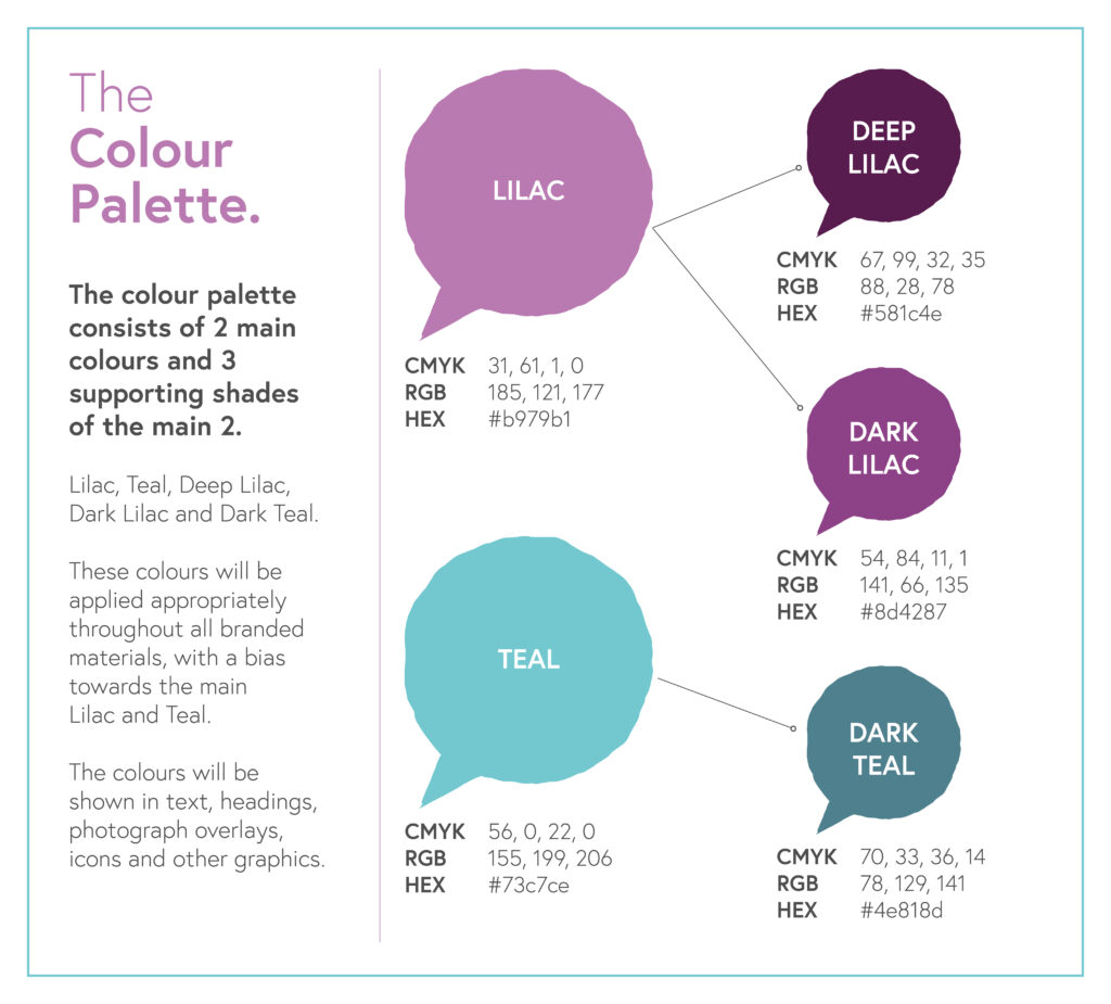
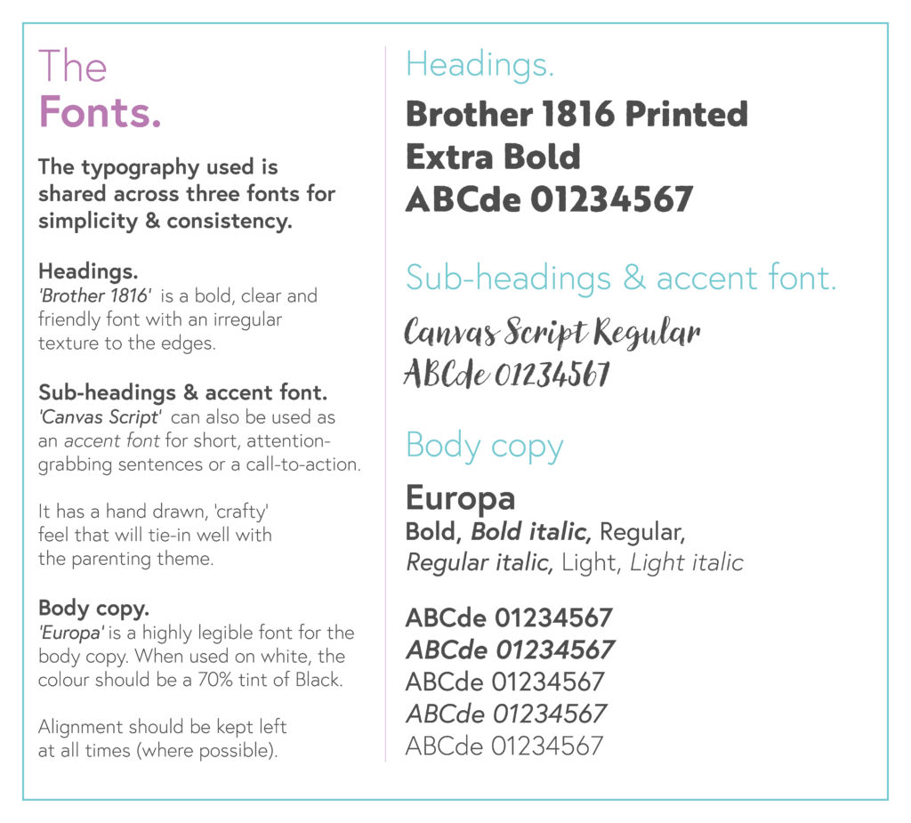
A calming palette of lilacs and teals gave the identity warmth and approachability, while textured typography added a crafted, human feel. Julie’s reaction to the first presentation was, in her words, “blown away” — which is always good feedback to get.
THE SOLUTION
The final identity is warm, clear and built on trust. Speech bubbles in the logo and across the wider visual system reinforce open dialogue and shared understanding, while the typography and colour palette strike a balance between professionalism and warmth.
I also developed tagline options — including “A Positive Parenting Podcast” and “Parenting with Purpose” — to help unify messaging across platforms.
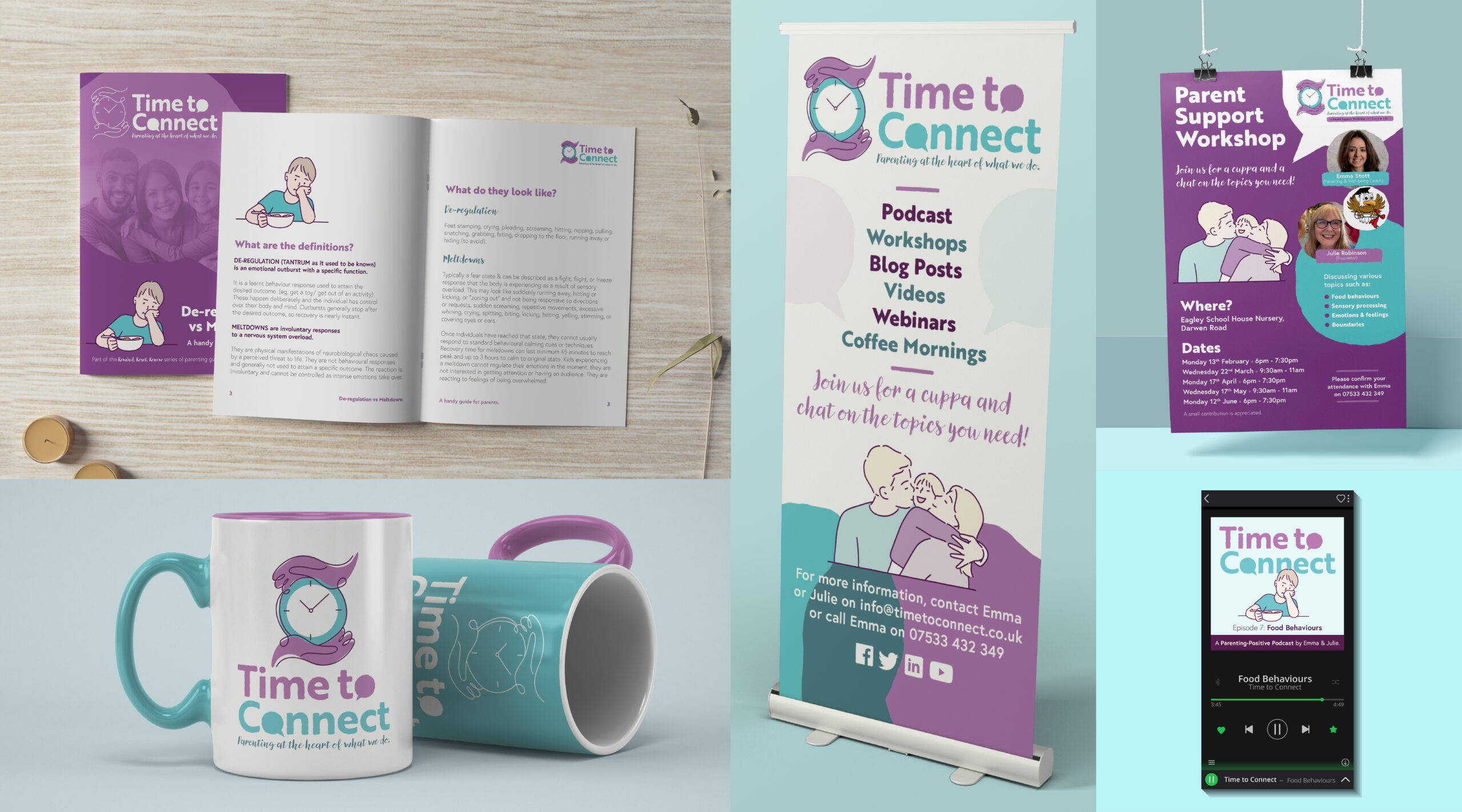
Since launch, the brand has expanded into real-world applications including flyers, banners, business cards and mugs, alongside a growing programme of events and support delivered under the Time to Connect name. The podcast is now available on Amazon (Audible), extending both reach and credibility.
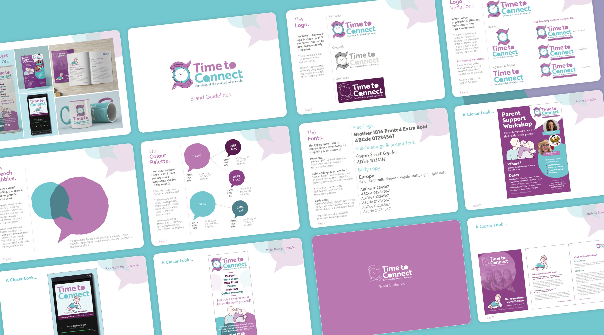
Full brand guidelines with visual and usage direction
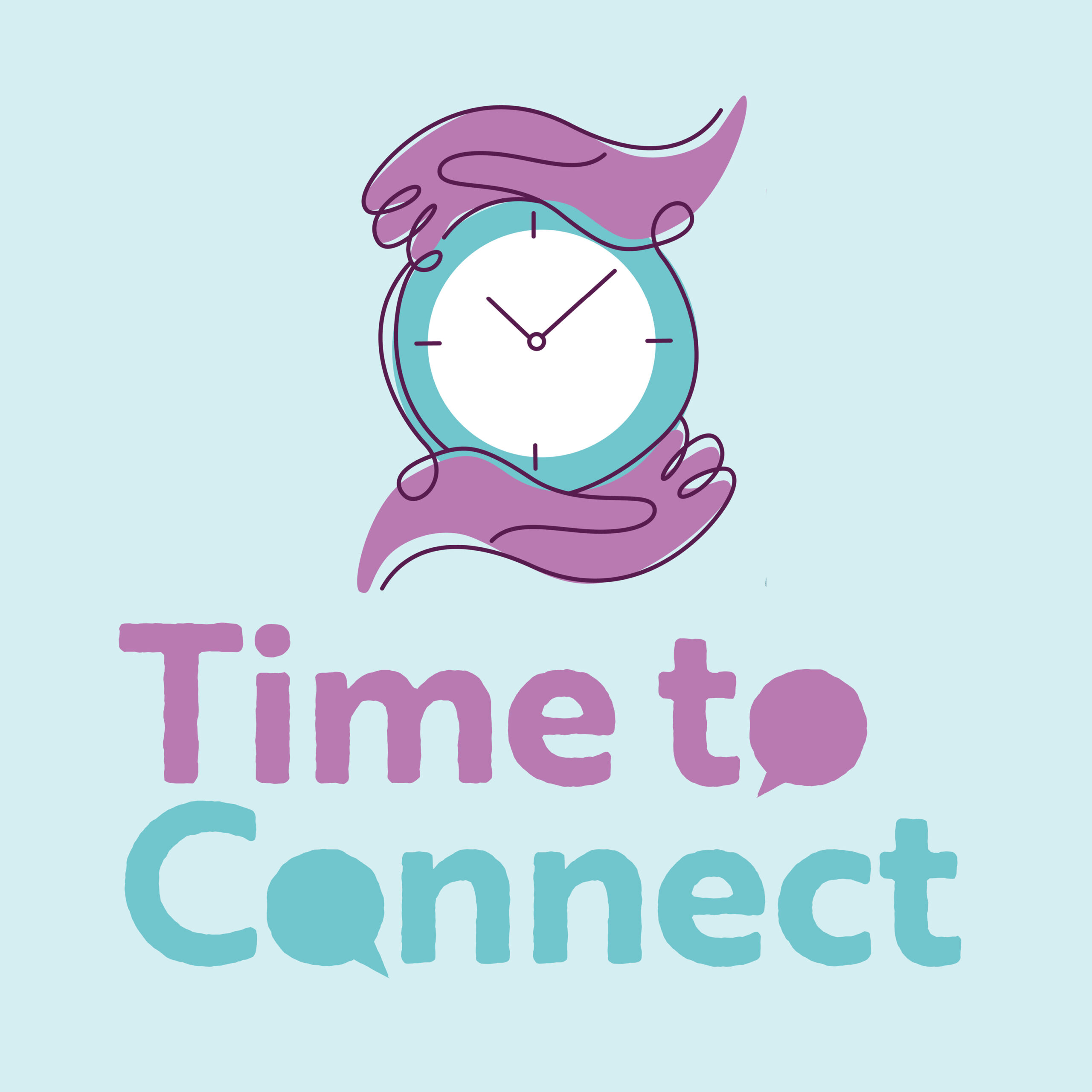
THE LOGO DESIGN
The identity combines symbols of care, time and conversation. The illustrated mark is drawn in a continuous line, forming a clock held within caring hands to represent both time and the supportive intent behind the project. Within the logotype, speech bubbles subtly form part of the lettering to reinforce the idea of communication and shared experience. The illustration and logotype can be used together or independently, allowing the brand to remain flexible across different applications.
As a team we sat down with Nige and talked over our ideas and goals and he really listened and came up with the whole concept, brand, colour schemes and produced a whole detailed brand guidelines… to remind us of the way to present ourselves across multiple platforms.
Paul Phipps-Williams Photography
★★★★★
It was not an easy brief, but Nige cracked it. I was presented with Brand Guidelines which have become my bible… ensuring a clean and consistent approach and giving me a strong bedrock for the future.
Gerry Mitchell
★★★★★
Founder & Director
Nige was with me, collaborating on the process from day one…I felt like he bought into my ideas, and really used his expertise to produce something of real value to me!
Odette Green Photography
★★★★★
Thank you so much I bloody love this!! I've had a good read through and love it all, nothing to change at all. It's all so me 🥰
Phillip Izzard
★★★★★
Founder & Director, Online Probate
I must say the final concept is stunning and has completely exceeded our expectations! The whole process was seamless and very professional…would highly recommend.
Julie Robinson
★★★★★
Founder, Time to Connect
Really professional, efficient, creative. Listened to what we wanted and delivered the branding exactly as we envisaged it.