The end result was exactly what was needed. As an experienced photographer about to go full time, I needed a brand which screamed polish and professionalism. Approachability, laid-back and fun but also a luxury brand. It was not an easy brief, but Nige cracked it. I was presented with Brand Guidelines which have become my bible, reshaping how I construct my website and my socials, ensuring a clean and consistent approach and giving me a strong bedrock for the future.
PAUL PHIPPS-WILLIAMS PHOTOGRAPHY
ABOUT THE BRAND
Paul Phipps-Williams is an experienced photographer who was preparing to step into full-time wedding work. He knew the quality of his photography was strong and that his clients adored him. The challenge was that his brand did not yet reflect the level of polish or personality needed for the next stage of his career. He wanted something that felt premium and confident, yet still approachable and true to who he is. Weddings are emotional. Couples need someone they can trust. Paul needed a brand that could communicate that before he ever picked up a camera.
THE CHALLENGE
The early sessions revealed a clear tension that needed resolving. One of the core challenges was finding the right balance between Paul’s proudly geeky personality and the level of polish expected from a premium wedding photographer. His couples often share the same interests and respond to that openness, but he was very clear that he did not want a novelty brand. He wanted something that felt warm, approachable and unmistakably him without drifting into anything that might look tacky or themed. The solution was to keep the visuals elegant and restrained and let the personality come through in the tone of voice. This gave Paul space to express his humour and enthusiasm in a natural way, while the identity itself stayed clean, confident and firmly positioned in the luxury space.
THE APPROACH
We began with a full discovery and workshop process. Before any design work began, we spent time understanding Paul’s values, personality and communication style. We mapped his archetype blend, explored how he likes to write and what he wants to avoid, and defined the purpose behind his brand. From this work the direction became clear. The visuals needed to stay elegant and restrained. The personality needed to live in his tone of voice.
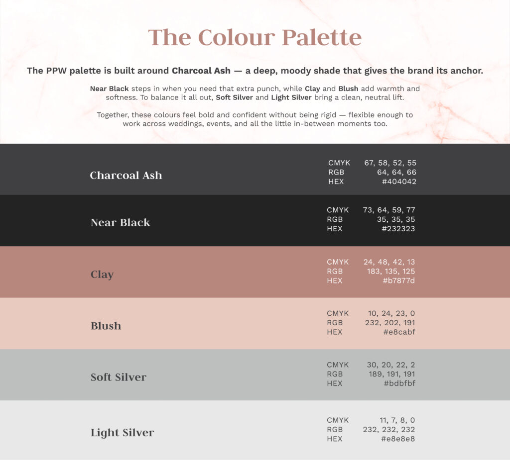
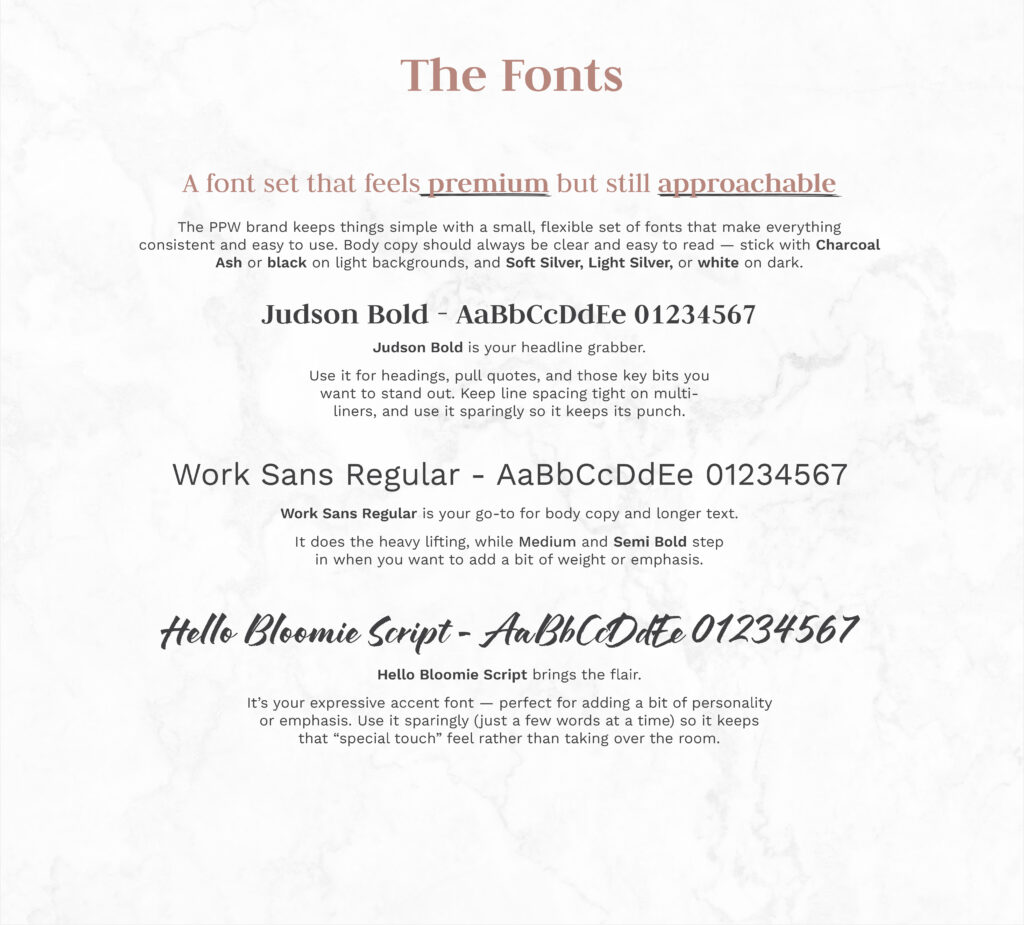
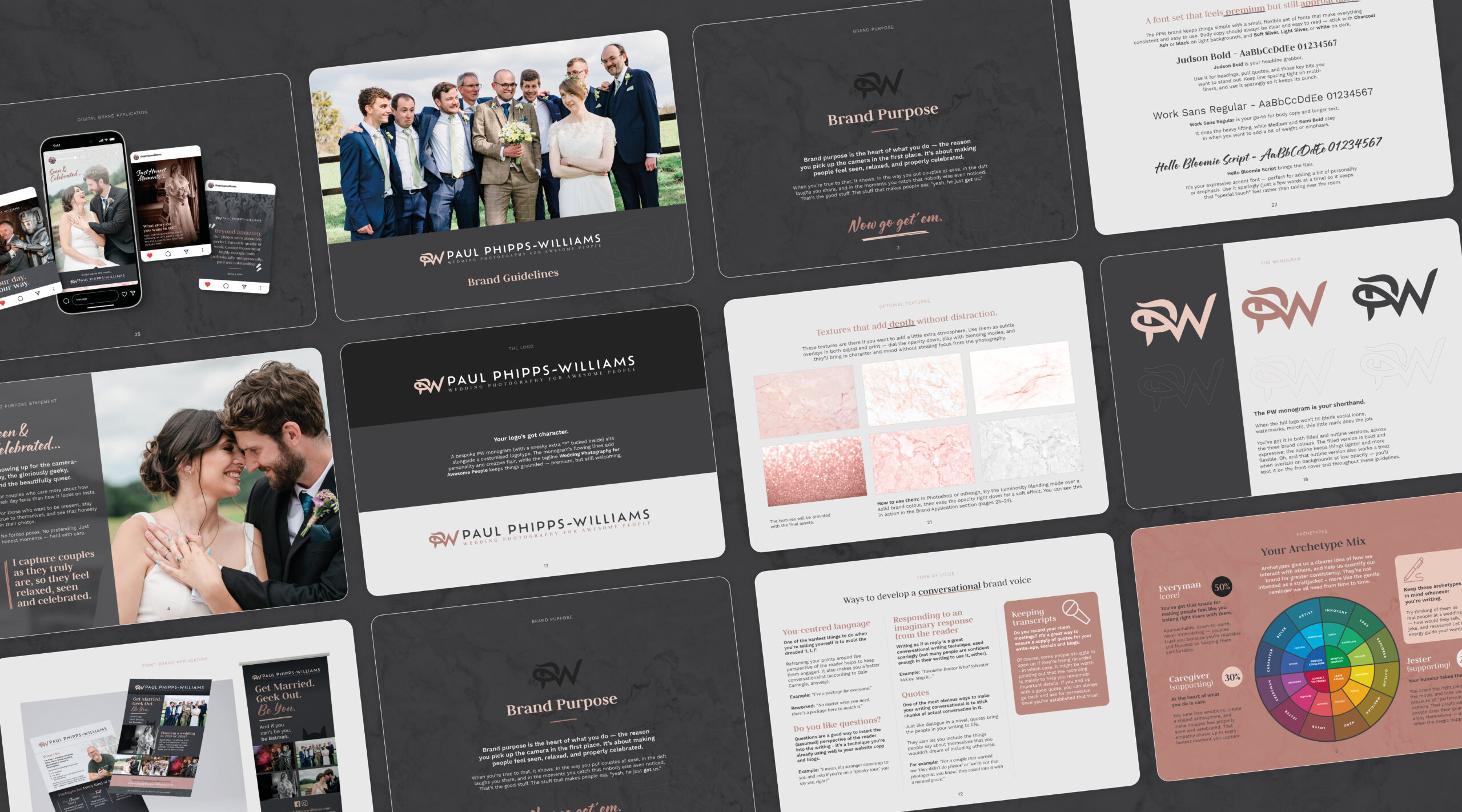
The brand identity was built around strong typography, a clean and confident layout system and a refined colour palette. These choices place him in the luxury space without losing approachability. The tone of voice guide carried the other half of the job. Warm. Observant. Human. Quietly witty. Geek references appear only where they feel natural and never in a way that distracts from the emotional weight of wedding storytelling.
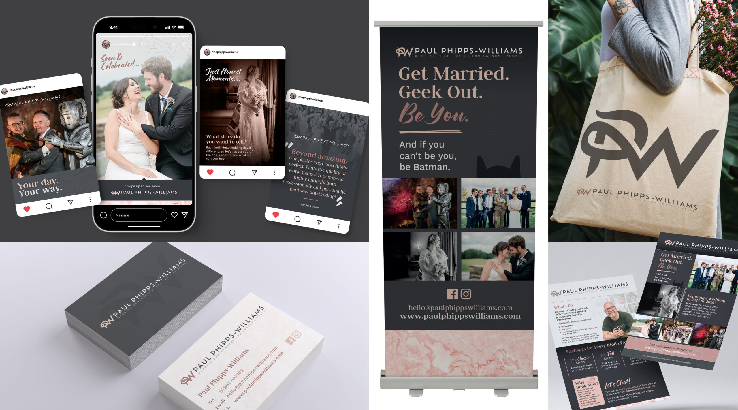
The result is a brand that feels premium without feeling cold. Approachable without feeling casual. Geek friendly without looking too niche.
THE SOLUTION
The final brand guidelines brought everything together in one clear document that Paul now uses across his website, his socials and all communication. The guidelines covered his purpose, archetypes, brand pillars, tone of voice, full visual identity, recommended usage and example applications. This gave Paul not only a finished brand but a long term foundation for how his business looks, speaks, behaves and grows.
He now has a brand that helps him stand out for the right reasons. It makes sense to his audience. It reflects the quality of his work. And it gives him the confidence to show up consistently wherever his brand appears.
SCOPE & DELIVERABLES
Discovery session and workshop
Brand purpose and strategy foundation
Archetype mix and brand personality
Tone of voice guide
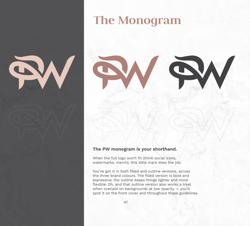
Logo development
Colour palette
Typographic system
Visual identity rules
Example applications
Full brand guidelines document
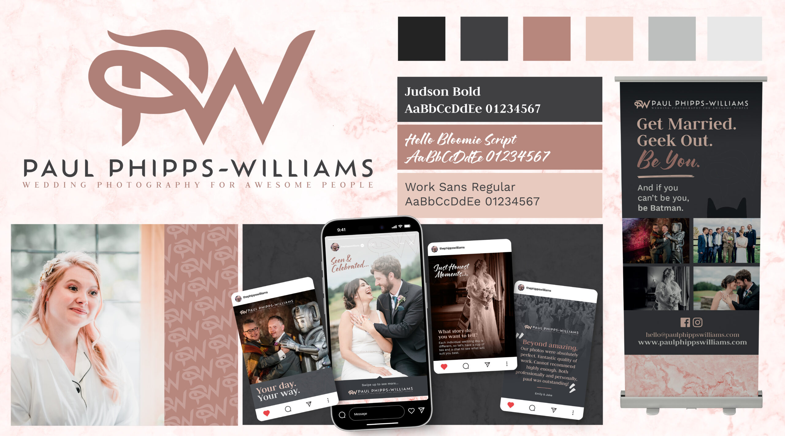
THE LOGO DESIGN
A bespoke PW monogram (with a sneaky extra “P” tucked inside) sits alongside a customised logotype. The monogram’s flowing lines add personality and creative flair, while the tagline Wedding Photography for Awesome People keeps things grounded,premium, but still welcoming.
As a team we sat down with Nige and talked over our ideas and goals and he really listened and came up with the whole concept, brand, colour schemes and produced a whole detailed brand guidelines… to remind us of the way to present ourselves across multiple platforms.
Paul Phipps-Williams Photography
★★★★★
It was not an easy brief, but Nige cracked it. I was presented with Brand Guidelines which have become my bible… ensuring a clean and consistent approach and giving me a strong bedrock for the future.
Gerry Mitchell
★★★★★
Founder & Director
Nige was with me, collaborating on the process from day one…I felt like he bought into my ideas, and really used his expertise to produce something of real value to me!
Odette Green Photography
★★★★★
Thank you so much I bloody love this!! I've had a good read through and love it all, nothing to change at all. It's all so me 🥰
Phillip Izzard
★★★★★
Founder & Director, Online Probate
I must say the final concept is stunning and has completely exceeded our expectations! The whole process was seamless and very professional…would highly recommend.
Julie Robinson
★★★★★
Founder, Time to Connect
Really professional, efficient, creative. Listened to what we wanted and delivered the branding exactly as we envisaged it.