Thank you so much I bloody love this!! I’ve had a good read through and love it all, nothing to change at all. It’s all so me 🥰
ODETTE GREEN PHOTOGRAPHY
ABOUT THE BRAND
Odette Green is a wedding photographer with a focus on real moments, relaxed energy and genuine connection. Still early in her journey, she’s already building a reputation for photography that feels natural and joyful — helping couples feel at ease in front of the camera while capturing the spark and emotion of the day.
THE CHALLENGE
Odette first heard about my work through the Shutter Circle crew. After a year in business using a basic Pixieset site, she was ready to invest in a cohesive brand identity before moving to a new website.
She wasn’t certain which package to choose, but knew she wanted a tone, look and feel that reflected her personality and her work — something warm, fun and professional, without straying into stiff or generic. The challenge was to guide her through that process in a way that felt collaborative, low-pressure and genuinely enjoyable.
THE APPROACH
We began with a relaxed, friendly email exchange — Odette wasn’t sure what package she needed, but was clear on one thing: she wanted a brand that felt unmistakably hers. I recommended a tailored version of my standard branding package, with a tone of voice add-on to help shape future website copy and marketing content.
After she shared a mood board, I followed up with a quote, project form and brand proposal. We then had a focused Zoom session to dig into her goals, personality and the type of experience she wanted to create for couples. The aim was to define a visual and verbal identity that felt natural, uplifting and quietly confident.
To develop the tone, I brought in copywriter Dan Lever. Together, we created a voice that reflected Odette’s warmth, approachability and playfulness — authentic and engaging, without feeling overworked or try-hard.
From there, I built out her brand purpose, tone of voice principles and visual system — guiding her through concept rounds until we landed on something that felt exactly right: modern, joyful and easy to work with.
THE SOLUTION
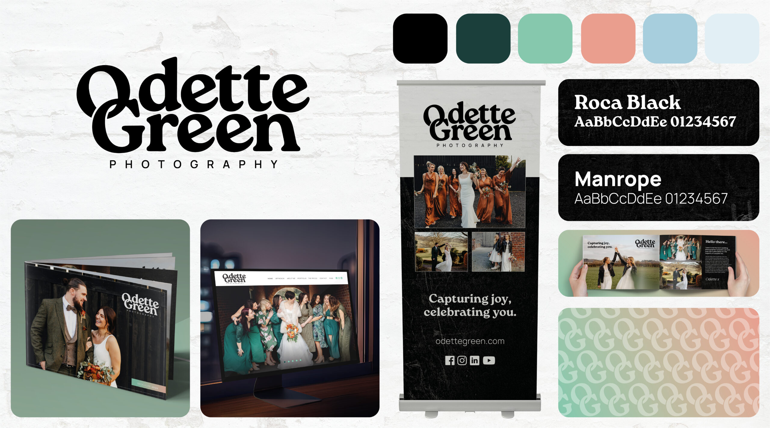
The final identity is warm, bold and full of personality — giving Odette a confident platform to grow her brand without losing the heart and soul behind it.
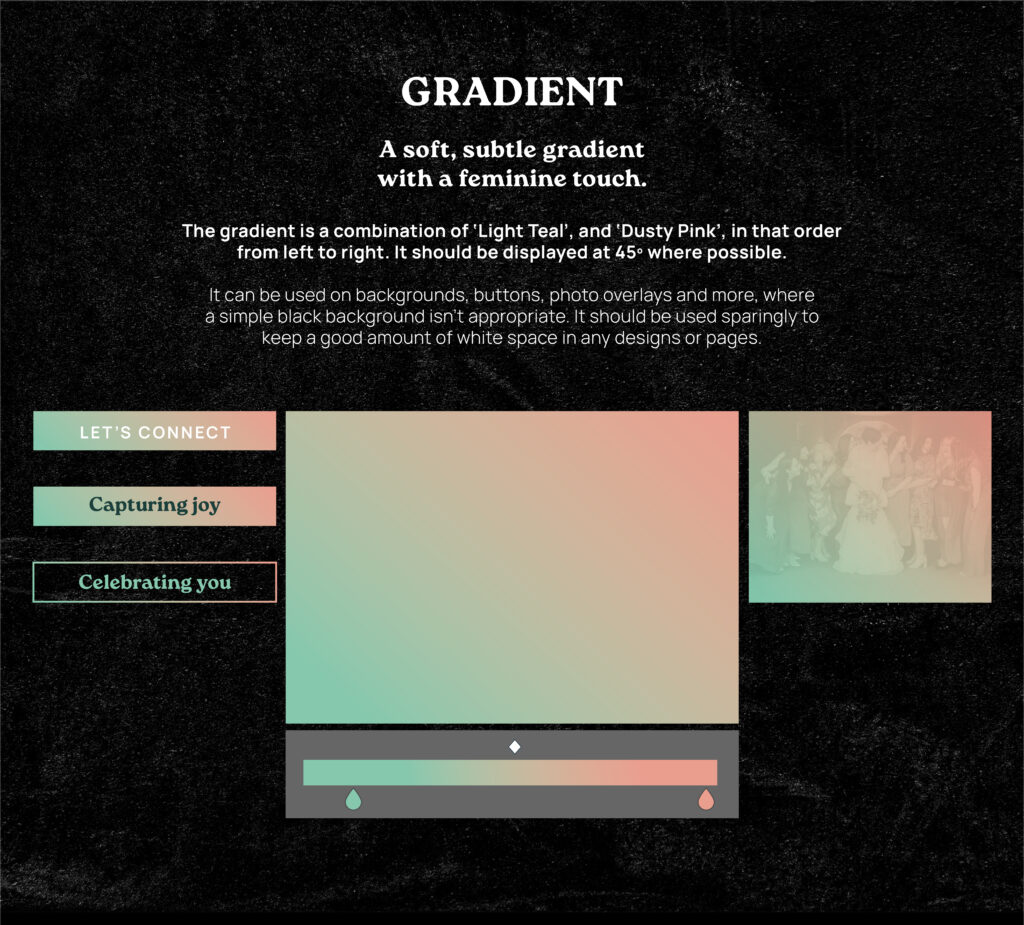
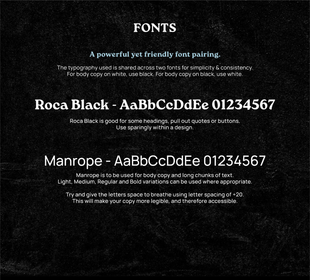
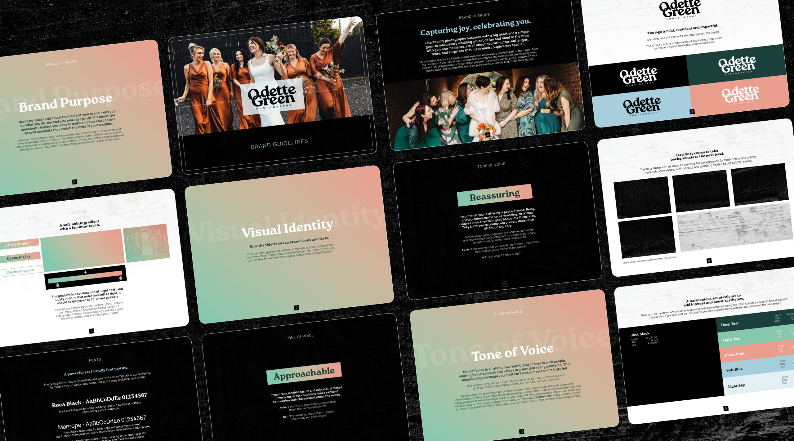
The logo is simple but meaningful: the O and G are subtly linked, reminiscent of interlocking wedding rings — a quiet nod to connection, commitment and celebration. The typography balances strength and friendliness, with Roca Black providing impact and Manrope adding clarity and flow. A soft gradient and warm, muted palette bring flexibility and femininity without falling into cliché.
The upfront strategy work was a key part of the project. Together with Dan, I helped Odette define a brand purpose centred on capturing joy, celebrating people and creating a relaxed space where couples can simply be themselves. That thinking runs through every touchpoint — from the visual identity to the brand voice.
We also created a detailed tone of voice guide, full of practical writing tips to help Odette communicate with confidence. It went beyond surface-level descriptors like “fun” or “friendly” to cover the how — sentence structure, rhythm, word choice, headings and pacing — all explained in plain English, with examples. The result is a tone that feels unmistakably hers, and a set of tools she can use every day as her brand evolves.
Together, the visuals and voice give Odette a distinctive, joyful presence — modern and human, without ever trying too hard.
SCOPE & DELIVERABLES
Discovery session & mood board review
Brand purpose development
Tone of voice development (with Dan Lever)
Logo design (logotype with interlocking ‘O’ and ‘G’)
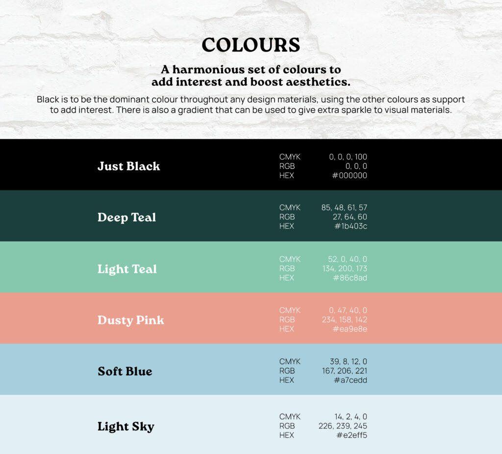
Colour palette & gradient
Font pairing & usage guidance (Roca Black & Manrope)
Tone of voice guidelines with real-world examples
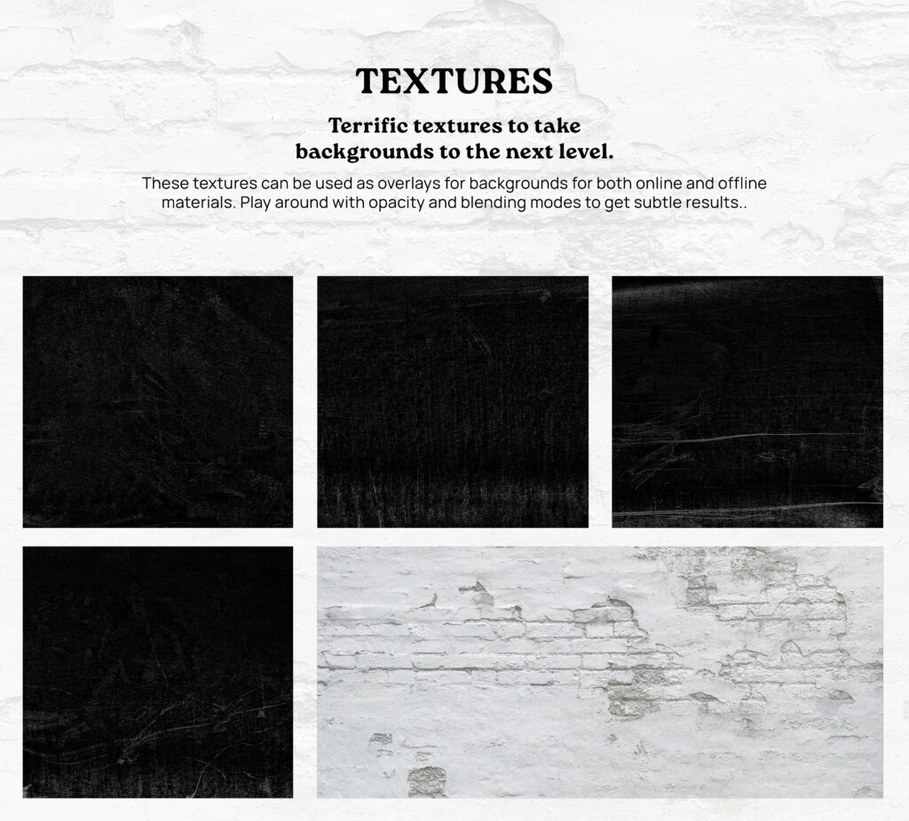
Texture library for backgrounds
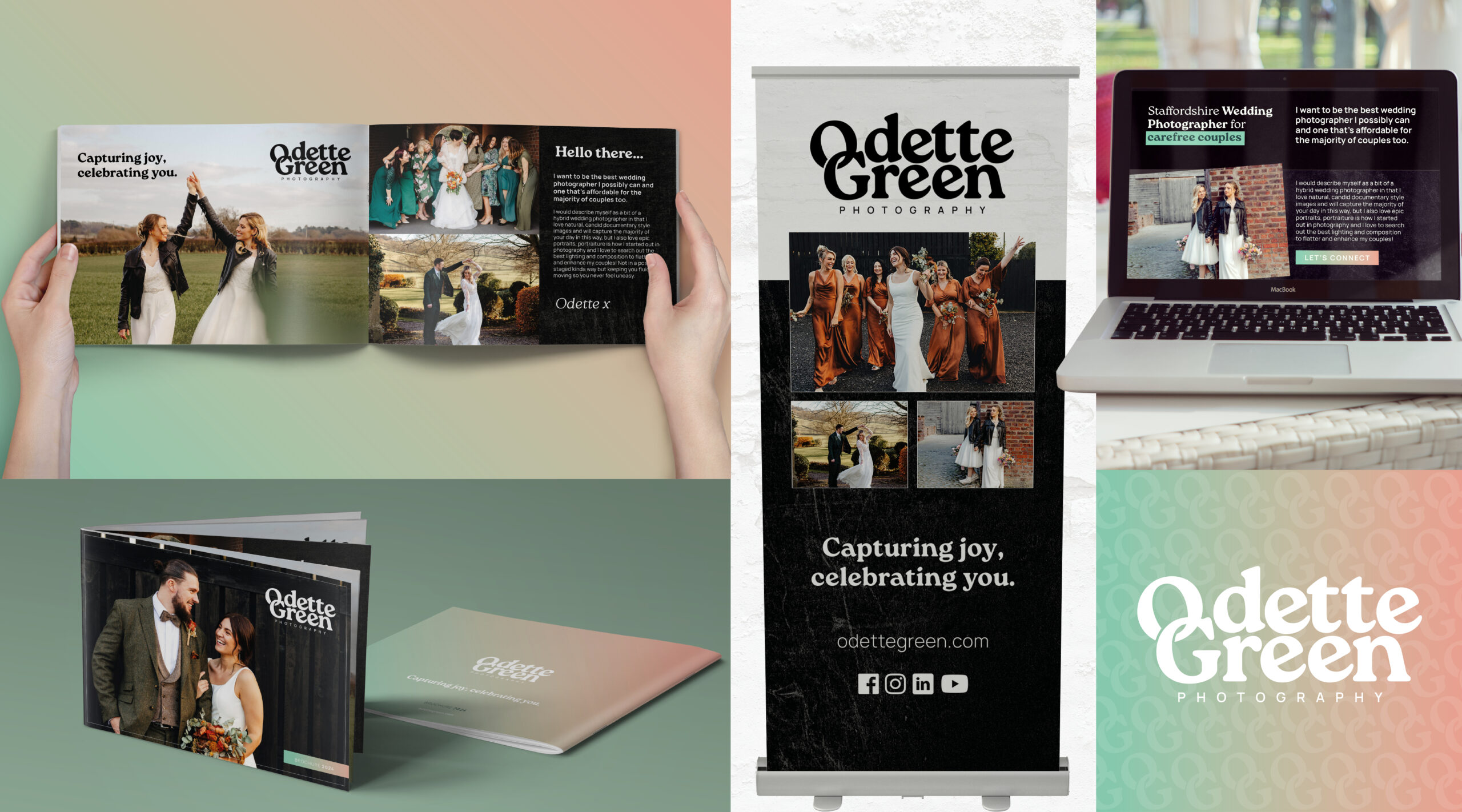
Brand mock-ups (social posts, web, print)
Full brand guidelines PDF with visuals, tone and usage
THE LOGO DESIGN
A bespoke logotype was created to reflect Odette’s bubbly personality, with the interlocking O and G forming a subtle reference to wedding rings and connection. The result is simple, bold and distinctive.
As a team we sat down with Nige and talked over our ideas and goals and he really listened and came up with the whole concept, brand, colour schemes and produced a whole detailed brand guidelines… to remind us of the way to present ourselves across multiple platforms.
Paul Phipps-Williams Photography
★★★★★
It was not an easy brief, but Nige cracked it. I was presented with Brand Guidelines which have become my bible… ensuring a clean and consistent approach and giving me a strong bedrock for the future.
Gerry Mitchell
★★★★★
Founder & Director
Nige was with me, collaborating on the process from day one…I felt like he bought into my ideas, and really used his expertise to produce something of real value to me!
Odette Green Photography
★★★★★
Thank you so much I bloody love this!! I've had a good read through and love it all, nothing to change at all. It's all so me 🥰
Phillip Izzard
★★★★★
Founder & Director, Online Probate
I must say the final concept is stunning and has completely exceeded our expectations! The whole process was seamless and very professional…would highly recommend.
Julie Robinson
★★★★★
Founder, Time to Connect
Really professional, efficient, creative. Listened to what we wanted and delivered the branding exactly as we envisaged it.