Nige was with me, collaborating on the process from day one.
As soon as I gave Nige a brief on what I wanted the logo to communicate to potential clients, I felt like he bought into my ideas, and really used his expertise to produce something of real value to me!
I am very pleased with the final outcome and the logo…
GERRY MITCHELL, FOUNDER & DIRECTOR
ABOUT THE BRAND
Livewell is a wellbeing consultancy founded by Gerry Mitchell, specialising in bespoke workplace wellbeing packages. Working across the public, private and third sectors, Livewell helps organisations introduce effective, sustainable wellbeing programmes through the lens of people, place and positive change.
THE CHALLENGE
Gerry came to me via a mutual connection with no brand in place but a clear sense of purpose: helping businesses enhance both their people and environments. He wanted a visual identity that communicated professionalism and calm authority — grounded and grown-up, but never dry or clinical.
The brief was deliberately open: no clear competitors, no design references, simply “open to ideas” — with a leaning toward something understated, modern and simple. It shouldn’t feel overly playful, but still needed to be approachable.
THE APPROACH
We began with a detailed project form and a series of exploratory conversations to clarify the brand’s positioning. The aim was to create a flexible consultancy identity centred on behaviour change, sustainability and practical workplace wellbeing — avoiding fluff or empty buzzwords.
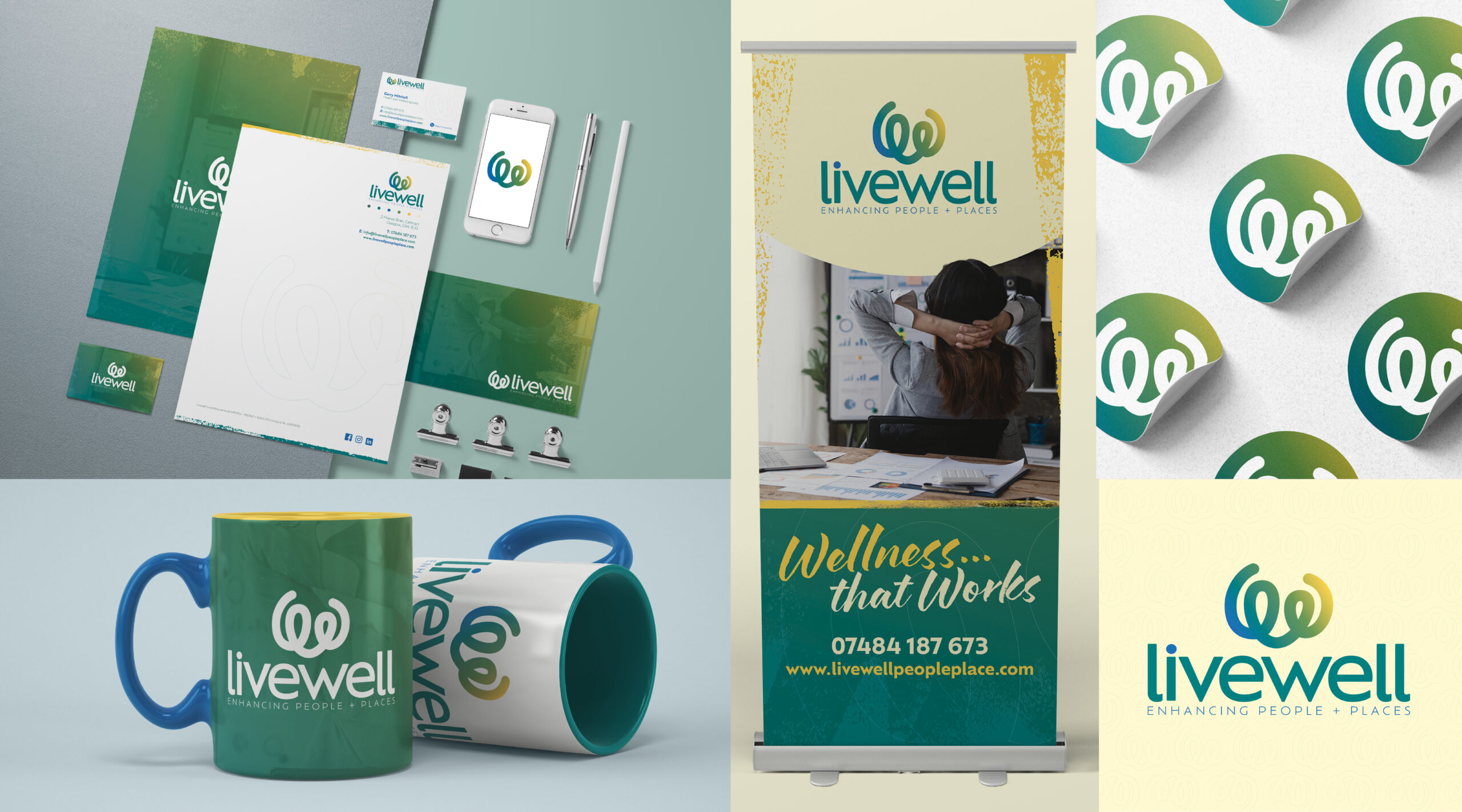
The design process started with pencil sketches exploring how the “l” and “w” could connect to form a fluid, human-centred mark. The chosen logo evolved into a symbol of two abstract figures reaching toward each other — representing connection, collaboration and uplift.
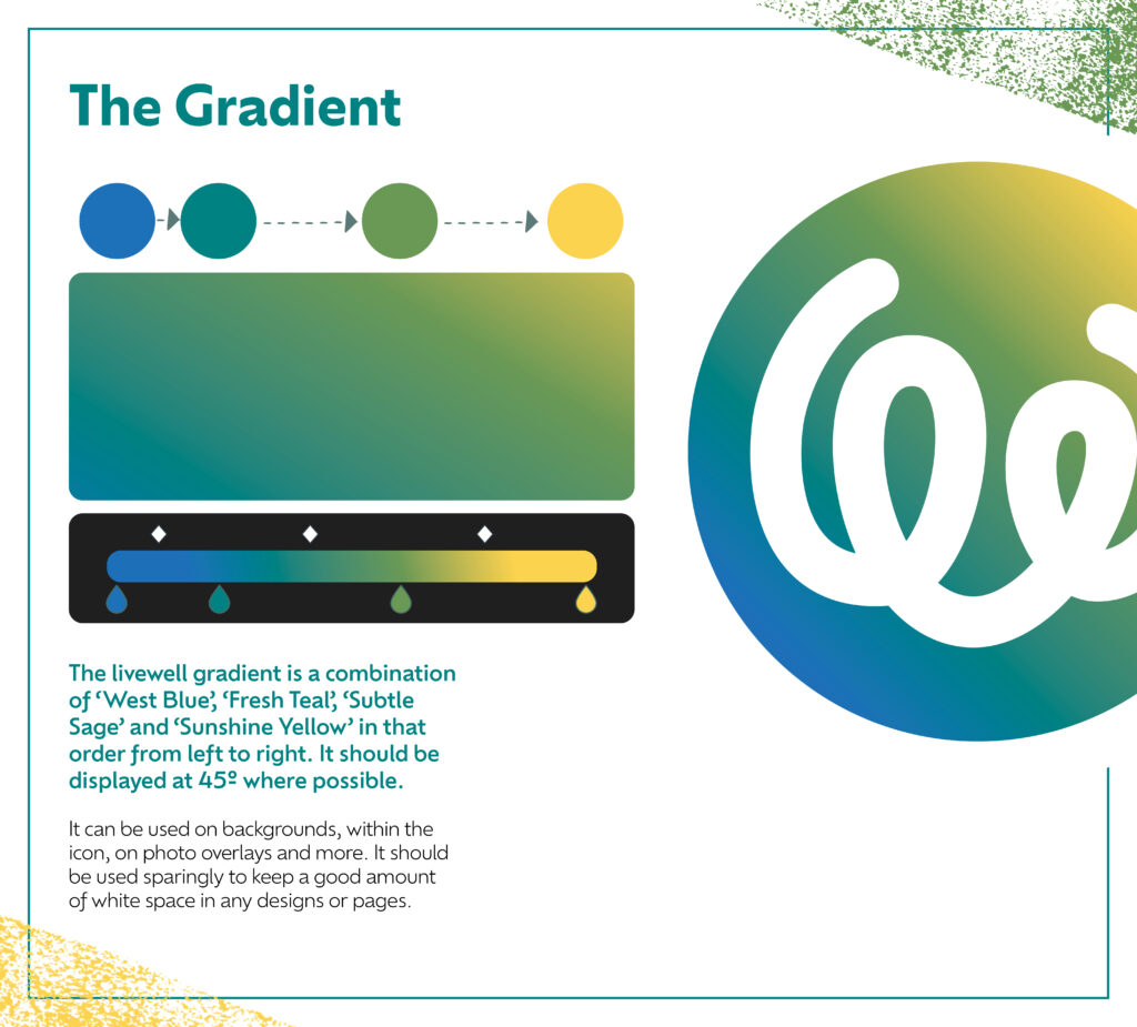
A cool-to-warm gradient brought energy and optimism, while the blue dot above the “i” in the wordmark served as a subtle nod to Gerry’s Scottish roots. Throughout, Gerry remained open and engaged, willing to push beyond the usual “wellness” clichés.
THE SOLUTION
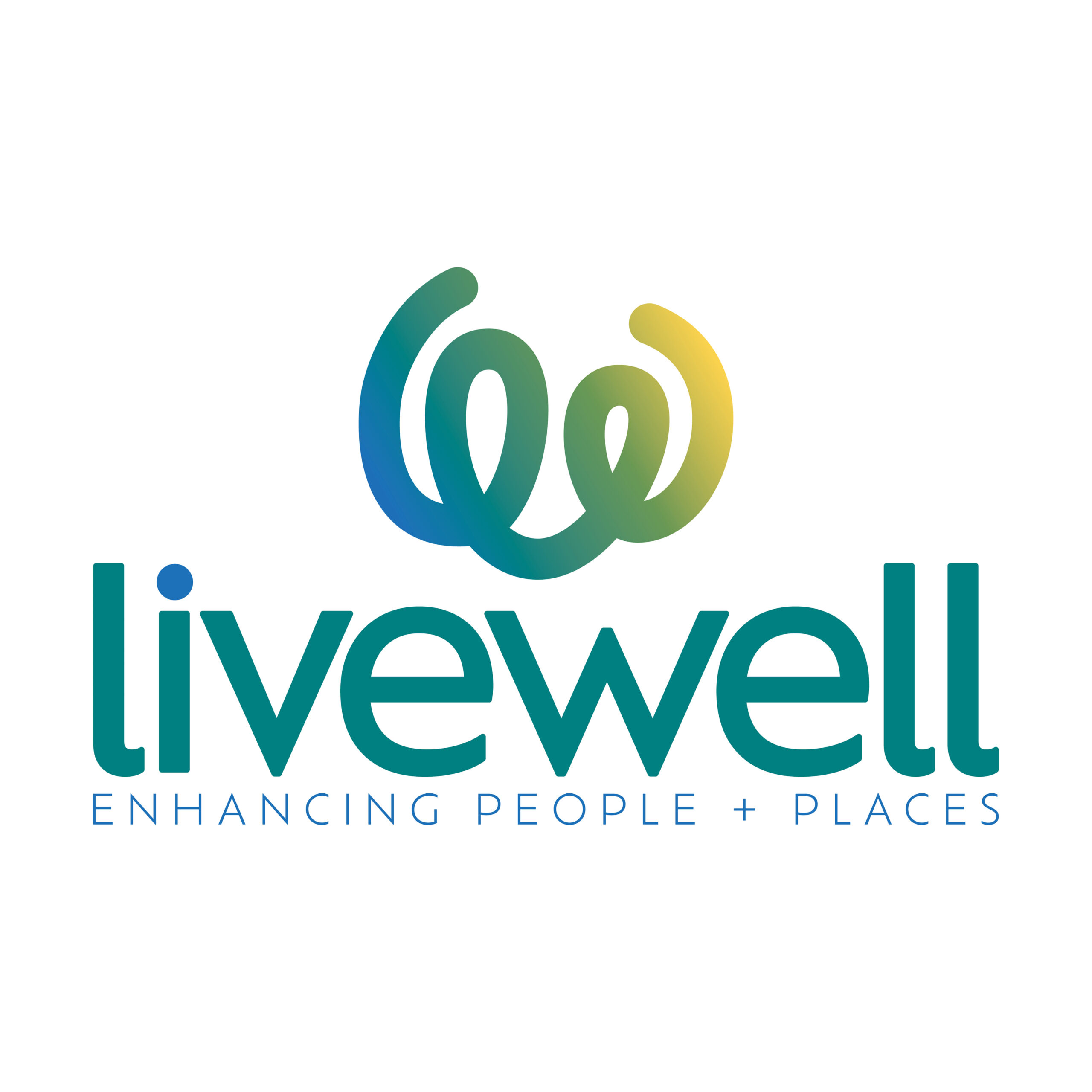
The final brand is calm, structured and quietly uplifting. The logomark strikes a balance between abstract form and human connection — two ‘people’ or forces meeting in the middle — while the strapline Enhancing People + Places reinforces the consultancy’s holistic focus.
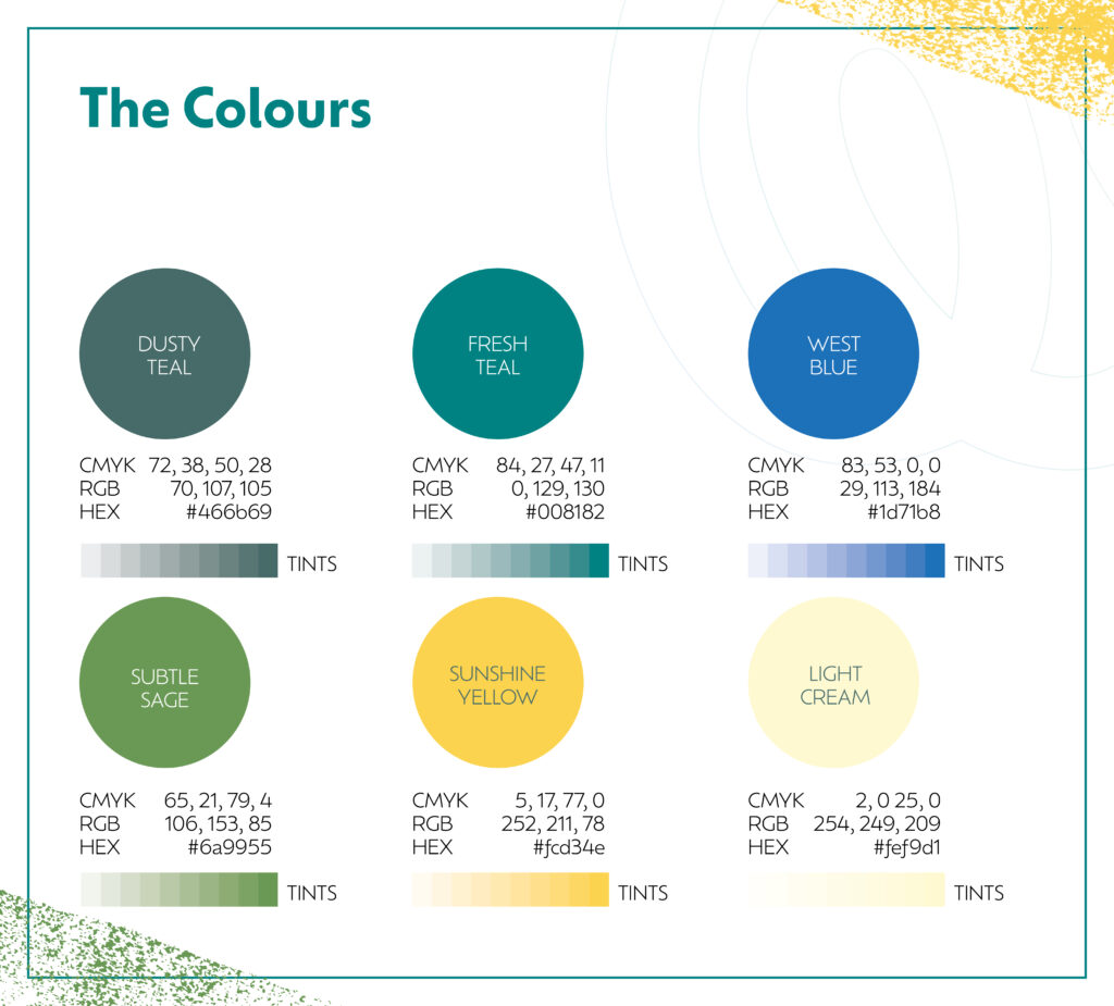
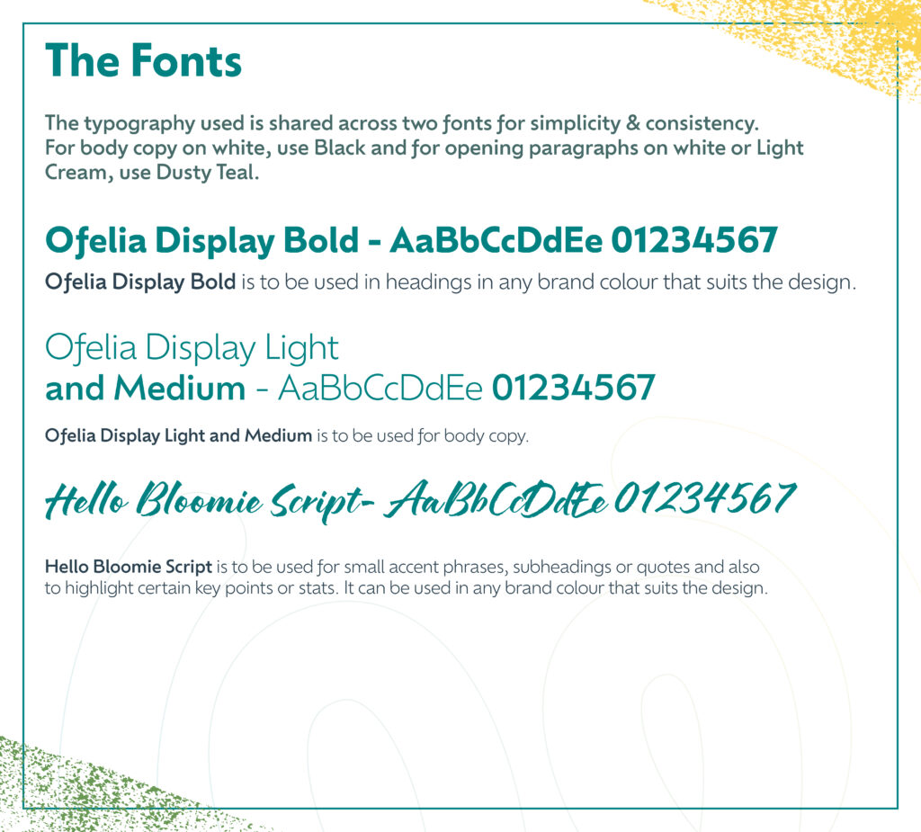
Typography and colours were selected to feel modern but not overtly corporate, bright but not brash. A subtle texture was introduced to soften applications like banners and business cards, lending a more human, tactile quality.
Since launch, I’ve supported Gerry with updated roller banner artwork, print-ready business cards and templates, ensuring the identity stays consistent and effective as the consultancy grows.
SCOPE & DELIVERABLES
Discovery consultation and project scoping
Visual identity development (logo, colour, typography)
Business card and letterhead design
Roller banner design (with later updates)
Brand texture assets
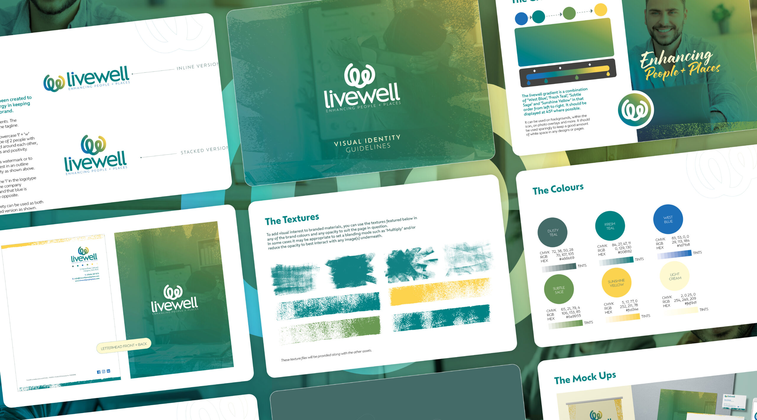
Final brand guidelines PDF
Ongoing brand support and print consultation
THE LOGO DESIGN
The mark is built from a loose L + W, but also reads as two abstract figures with hands raised. A quiet nod to connection. A cool-to-warm gradient adds optimism, while the blue dot above the “i” subtly references Gerry’s Scottish roots.
As a team we sat down with Nige and talked over our ideas and goals and he really listened and came up with the whole concept, brand, colour schemes and produced a whole detailed brand guidelines… to remind us of the way to present ourselves across multiple platforms.
Paul Phipps-Williams Photography
★★★★★
It was not an easy brief, but Nige cracked it. I was presented with Brand Guidelines which have become my bible… ensuring a clean and consistent approach and giving me a strong bedrock for the future.
Gerry Mitchell
★★★★★
Founder & Director
Nige was with me, collaborating on the process from day one…I felt like he bought into my ideas, and really used his expertise to produce something of real value to me!
Odette Green Photography
★★★★★
Thank you so much I bloody love this!! I've had a good read through and love it all, nothing to change at all. It's all so me 🥰
Phillip Izzard
★★★★★
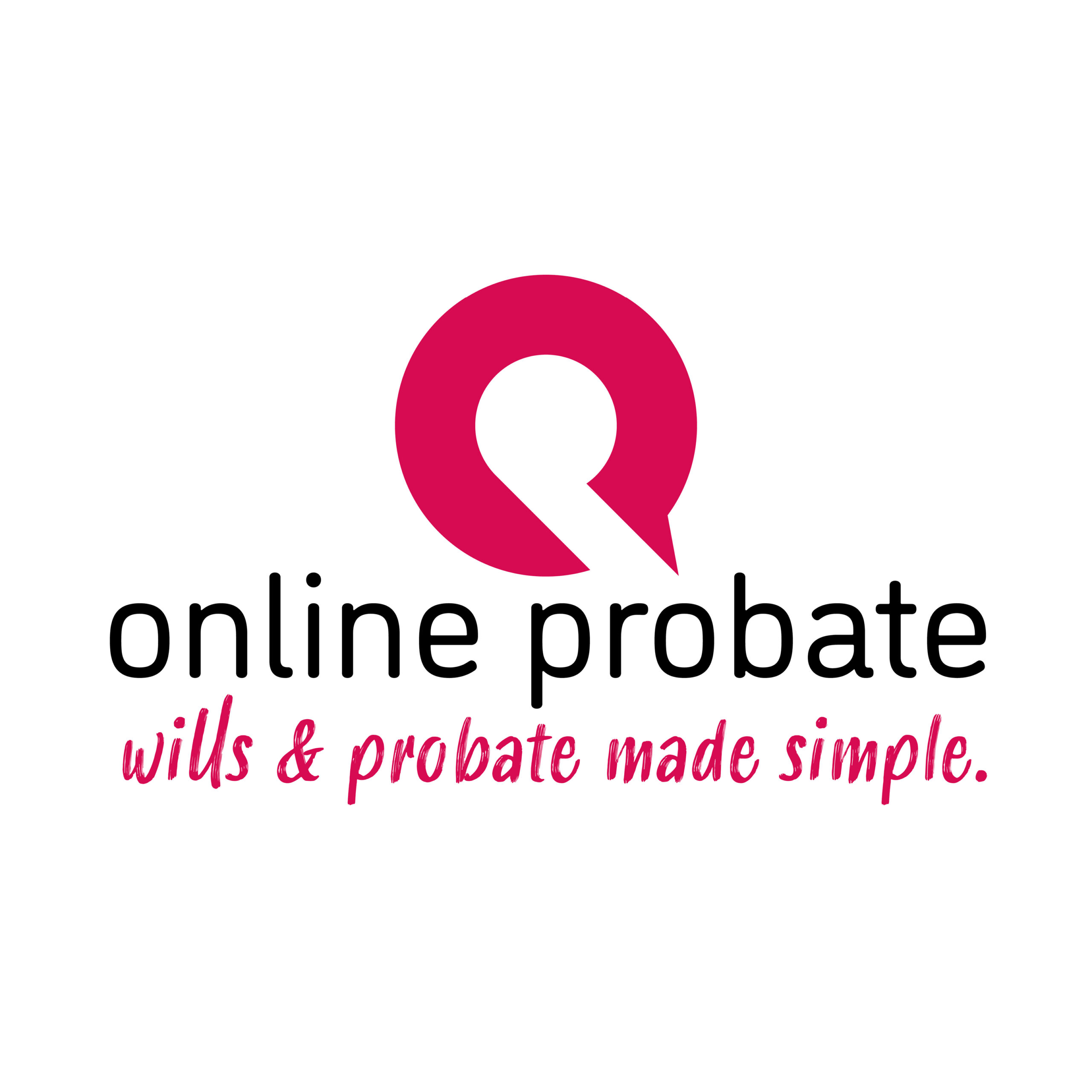
Founder & Director, Online Probate
I must say the final concept is stunning and has completely exceeded our expectations! The whole process was seamless and very professional…would highly recommend.
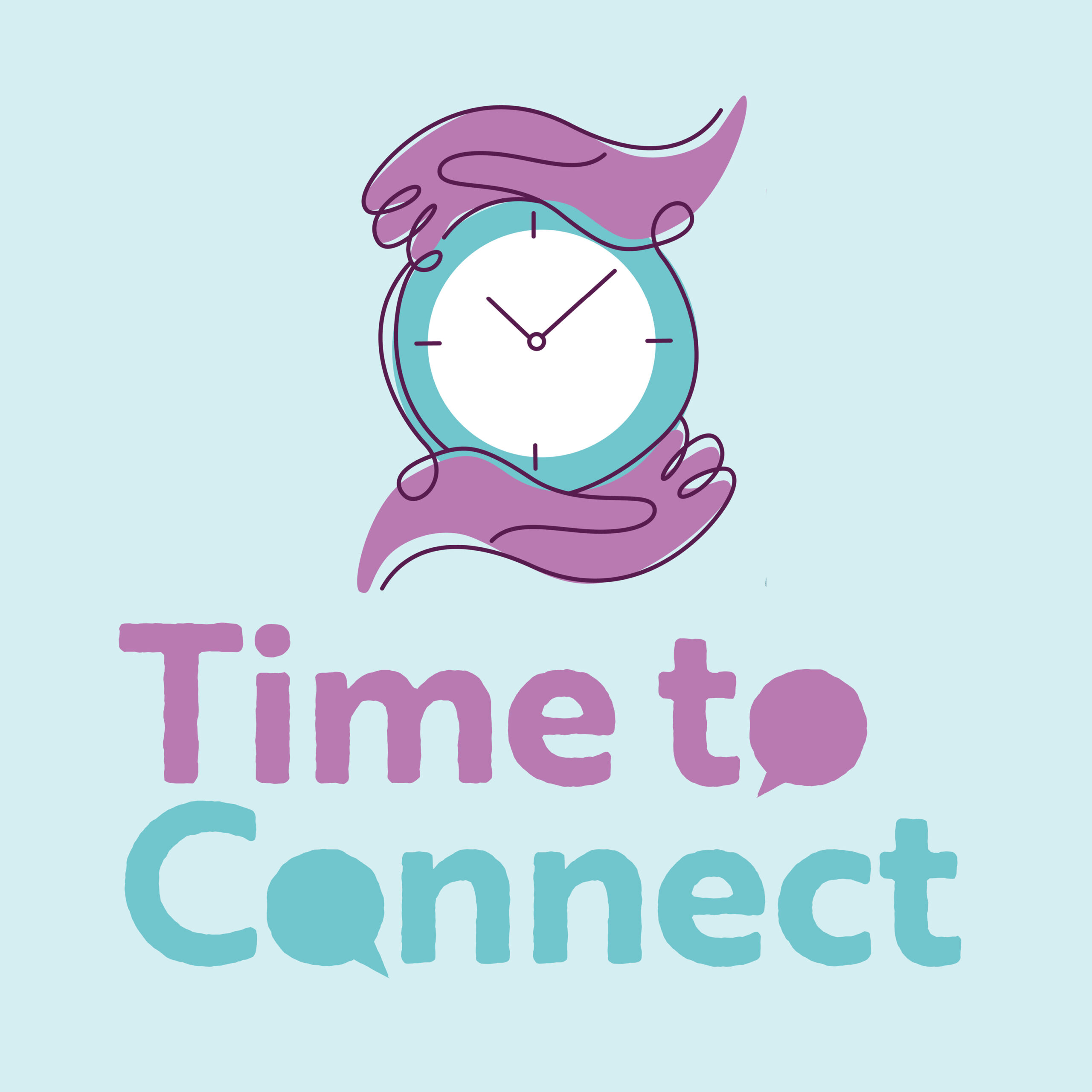
Julie Robinson
★★★★★
Founder, Time to Connect
Really professional, efficient, creative. Listened to what we wanted and delivered the branding exactly as we envisaged it.